

APOLLO lands on a fresh new look and better-tasting classics
share on
Malaysia’s beloved childhood snack brand Apollo is making a comeback with a bold new look, enhanced flavours, and a renewed brand direction, refreshed for today’s generation of snack lovers.
After decades as a staple in local lunchboxes and family pantries, Apollo’s latest campaign aims to reconnect with modern consumers while honouring the familiar tastes Malaysians and Singaporeans grew up with.
From creamier textures and bolder flavours to pack sizes designed for convenience, the refreshed offering marks both a glow-up and a nod to the brand’s long-standing legacy. While the brand refresh is currently being rolled out across Malaysia, Apollo says a Singapore launch could be on the horizon.
Don't miss: Maxis hits refresh with new brand promise: “Tomorrow begins today”
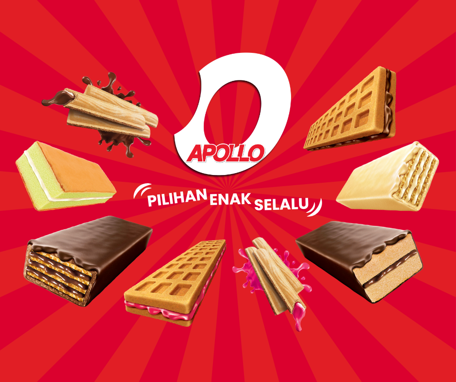
The new logo, centred around the iconic “O” in Apollo, anchors the rebrand with symbolism of reinvention, optimism and openness. “It is an acceptance of our heritage, but with a clear forward thrust to the future,” said Warren Chan, head of marketing at Apollo Food Holdings, in an exclusive conversation with A+M. He also added:
With evolving consumer tastes and rising expectations, it was time for a bolder, more future-ready identity.
The brand worked closely with selected creative and activation partners over a 10-month process, from ideation to final rollout. “We chose collaborators who truly understood the brand's soul and commercial ambition. A strong brand without a strong story is wasted potential,” added Chan.
The result, he said, is branding that is “creatively progressive and commercially grounded,” with careful feedback gathered from longtime Apollo fans.
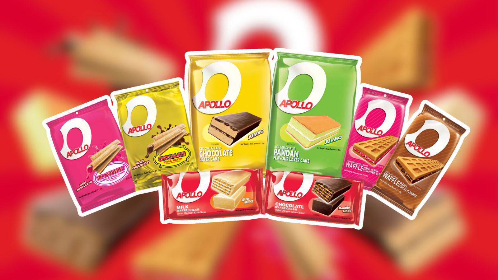
The revamped product lineup features improvements across all fan favourites, including richer chocolate coatings, smoother milk cream, and the introduction of crispy cream-filled waffles, a brand-new addition to the Apollo family.

Other familiar names such as the chocolate wafer cream, milk wafer cream, layer cakes, and stick wafers have also been updated in both taste and texture. Pack sizes now include 3-, 6-, and 8-pack formats to suit different snacking occasions.
Apollo has also taken this moment to officially step into the digital space. “We enter the digital space with strategic intent, not by pressure,” said Chan. “The timing aligns with our brand transformation and our route-to-market changes."
We have a stronger story to tell, and a clearer voice to engage with the next generation of Malaysian snack lovers.
Chan also shared with A+M that a nimble social media agency is supporting Apollo’s efforts to build digital presence while keeping content authentic.
Beyond the visual and product refresh, Apollo is gearing up for more activations over the coming months. These include influencer partnerships, on-ground sampling blitzes, and strategic retail initiatives to make the brand more vibrant and visible — whether on shelves, on screens, or on the streets. Chan said:
This brand refresh signals more than a new look, it marks a renewed ambition.
He also added: “We are reshaping the APOLLO brand to be bolder, more joyful, even more tasty and more attuned to modern snacking culture. Our goal is clear: to re-ignite love for the APOLLO brand, one bite at a time.”
APOLLO is not the only long-time F&B who has decided to undergo a facelift. Last month, Auntie Anne’s gave its storefront a bold new makeover, introducing a refreshed design aimed at deepening cultural relevance and capturing the attention of Gen Z and Millennial snackers.
The redesign comes as the pretzel chain looks to modernise its footprint across formats while reinforcing its playful, hand-crafted identity. Designed to cut through the visual clutter of today’s retail environments, the updated store concept features modular layouts, signature blue accents, and “twist”-inspired graphics that spotlight Auntie Anne’s iconic knotted pretzels.
Meanwhile in November 2024, Pokka unveiled a fresh new look for its green tea, fruit tea, Oolong teas, juices and Asian drinks range. In an Instagram video from Pokka, the canned drinks retain the same colours and design but are now longer and sleek. This is a departure from the brand's previous short and rounded cans. Accompanying the Instagram video is a caption that reads "The old cans have made way for a fresh vibe, with the same great taste".
Accelerate your brand’s growth with AI-first strategies, emerging tech and data-driven experiences. Join the industry's leading marketers at Digital Marketing Asia 2025 Malaysia on 30 October to uncover transformative trends, real-world wins and powerful ideas for 2025 and beyond.
Related articles:
Pokka unveils sleek new look for canned drinks range
Sara Lee debuts new look and ‘Bring the Love’ brand platform
Auntie Anne's twists into bold new look to win over Gen Z
share on
Free newsletter
Get the daily lowdown on Asia's top marketing stories.
We break down the big and messy topics of the day so you're updated on the most important developments in Asia's marketing development – for free.
subscribe now open in new window